PS: The 'Portrait Sharing' Project.
Well it's the start of a new week, so we thought, why not start a new tradition?
Portraiture has always been at the centre of what we do, and why we fell in love with photography in the first place. We think it's rad that in a single image, you can tell someone's story, create a character, or set an entire scene. They can be super simple, or crazy elaborate. But no matter what, a portrait tells a story and that's what we love most about them.
So, because of our love of portraits, we thought it would be fun to start looking back at some of our favourites and share them with you guys each week, including some background on the inspiration, why we did particular styles, lighting, etc!
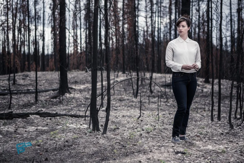
This idea came to me when I was going through the archives and came across this portrait of one of our favourite artists, the lovely Rosemary Scanlon! It made me think of all the times we take shots for a particular client (in this case, a magazine profiling her work), where often the client only needs one shot, but we end up with quite a few that we love...
SO, what better way to to look back on some of our favourite shots, than to share them with you guys? And while we're on this sharing train, we thought why don't we keep it rolling and get you guys involved?
We thought it would be rad to see what you're creating too!
Now, anyone who's taken our courses knows one of our favourite sayings is that "the best camera is the one you have on you." So we don't care if you're taking your shots with an iPhone as a hobby, or have the newest professional gear on the market-you can get creative with anything! So if you have an image you think fits the theme of the portrait we've posted, share it in the comments section of our Facebook post and let's see what everyone is creating!
Note: This isn't about critiquing or judging who's doing what, it's just about sharing images you're proud of, so the only rule is to keep it positive! The internet has enough negativity on it, so we want only supportive comments and postings!
And with that, welcome to our new tradition- PS: The 'Portrait Sharing' Project
For this first week, let's talk environmental contrast.
For this portrait in particular, we used an old forest fire burn site as our location to create a nice contrast between Rosemary's polished look and her surroundings. One of Gary's favourite things is when there is a stark contrast between the subject of the image and the environment. A space that isn't what you necessarily normally see the person in, adds an extra element to your image. The key is making sure that the background doesn't become over distracting and take away from your subject.
So with Rosemary, we really wanted to do something a bit different than having her portrait done in her studio which you might normally expect for a feature on an artist. The burn site actually ended up being a perfect location as it was an interesting backdrop, but still incorporated a lot of the tones and colours that she happened to have in her work at the time. Her water colour paintings included a lot of darker backdrops, and stark trees mixed in with incredible colourful details. If you haven't seen her work, do yourself a favour and check out her website at: http://rosemaryscanlon.com
For the lighting we kept it simple and used one Octa-box camera right as it was a cloudy day, so there was already great light for what we were looking for.
And speaking of contrast, Gary is not only a fan of it in terms of storyline/backdrop, but also in terms of the dark to light ratio in his editing process, which you'll also notice in this image.
And here you have it!
We're stoked to go through the archives and find more to share with you guys over the next few weeks!


